Welcome to our new fall series, where we unpack our organization’s most nuanced award categories. If you have ever stared at the awards category list wondering where a standout piece truly belongs, this series is for you. Over the coming months, we’ll demystify the criteria, share what judges look for behind closed doors, and highlight past winners that set the bar.
What the Story Packaging Description Says
This award honors the outstanding combination of writing and design. The layout should include graphics, sidebar(s), and/or other visual elements beyond the primary article to enhance the reader experience. Entries should demonstrate:
Creative use of typography, color, photography, illustration, infographics, and/or other visual elements to enhance the reader experience
Impact of the art direction to entice readers to read the entire piece
Effectiveness of organizing a variety of content without looking unintentionally cluttered
TL;DR: Great story packaging transforms dense or complicated narratives into an inviting, multi-layered visual experience.
How It Differs from Writing or Design Awards
This category doesn’t evaluate narrative writing or layout aesthetics in isolation—it focuses on the collaborative architecture of the piece.
So, is it judged on writing or design?
Both, but visual execution carries heavy weight. The evaluation of writing shifts away from more longform prose and zeroes in on headlines, deck/subheadings, pull quotes, captions, sidebars, and callouts that integrate with the graphics.
When should this style of design be used?
Submit pieces where text and layout are inseparable, complex, and/or data-heavy. Usage examples include hefty timelines, campaign reporting, supplemental profile info, and pieces with multiple subjects or heavy subject-matter (see example below).
The Pre-Submission Gut Check
Before submitting a feature to this category, ask yourself:
Is there an intuitive entry point for both casual skimmers and longform readers? Does display type guide the eye naturally to areas of emphasis?
If someone only read the headings, lede, sidebars, callouts or other “non-traditional coverage,” would they still get a general idea of what the piece attempts to convey?
Do the visuals add value to the overall piece? Would it lose significant context, energy, or comprehension without these sidebars and graphics?
Up Close
Story Packaging Long, First Place Winner
Pi Beta Phi, The Arrow, Spring 2025
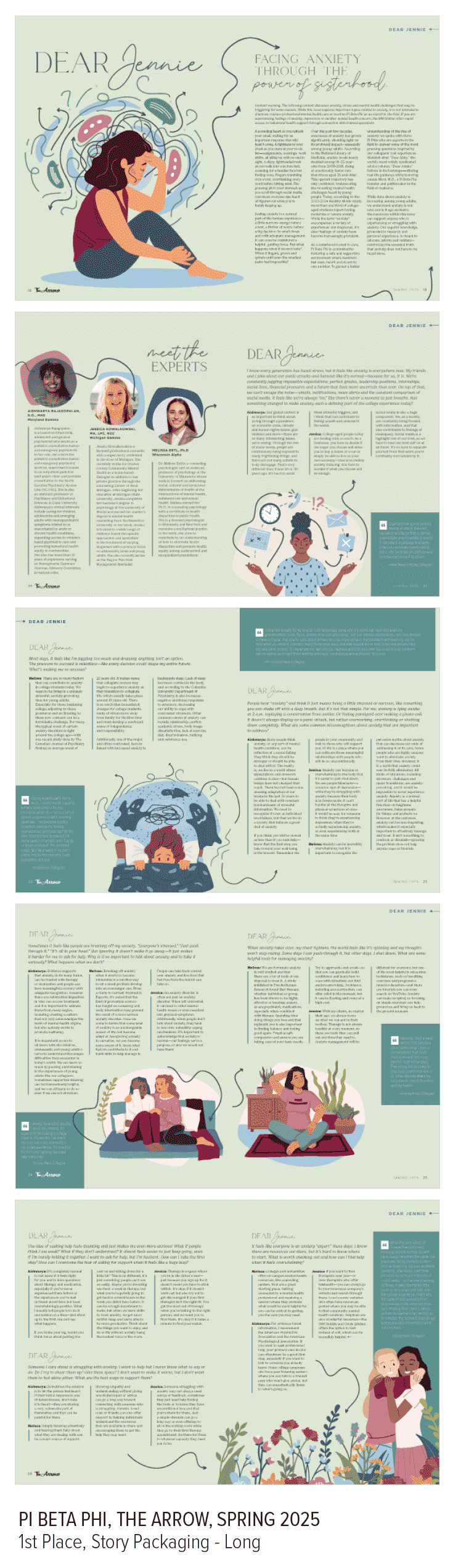
View the article in its entirety here.
What the judges said:
This looks like something you’d something you’d see a major mental health company like Talkspace, Lyra, etc. promote as a resource. This is the definition of story packaging—the illustrations fully support the copy and work together to contribute to storytelling instead of just sitting side by side. The team did a great job taking a current issue for all collegiate women and putting it in the lens of the organization.
The use of color theory for a calming palette works like a charm, especially with the negative space giving a calm, organized, in-control feel.
Using photography of people for a piece like this is usually a bad idea, and the illustrations feel current, well executed and allow for visual representation of your membership.
The abstract shapes behind the illustrations and headshots feel current, give great texture and pops of color contrast, and give softness to a sensitive subject that perfect circles, ellipses, and edges vs. curves would not achieve.
The subtle progression of the illustrations successfully handling anxiety throughout the piece is a nice touch.
The illustrations give a pretty good feel for what I imagine anxiety to “look like” if I had to draw the chaos in my head without making a reader feel chaotic.
The typography is modern and executed perfectly.
The layout subtly feels like a newspaper advice column to go with the theme yet feels current.
Bonus Points:
Why is Pi Beta Phi the authority on mental health? They aren’t, but they know experts who are. Adding the credentials of the members who weighed in on the “letters to Jennie” was necessary to legitimize the content—and it allowed them to showcase three of their members.
Great story packaging doesn’t happen by accident—it’s the result of writers, editors, and designers collaborating from pitch to print. As you plan your submissions this season, look for the stories where the design didn’t just decorate the text, but completed it.
Up Next: You tell us!
Merchandise Promotion, Educational Resources, Event Branding, Alumni/ae Engagement, Magazine Design Special/Recurring Section—or you tell us what you want to see. Email your questions to the Recognition Committee at fca1923awards@gmail.com.